
History of graphic design
This article has multiple issues. Please help improve it or discuss these issues on the talk page. (Learn how and when to remove these template messages)
|

Graphic design is the practice of combining text with images and concepts, most often for advertisements, publications, or websites. The history of graphic design is frequently traced from the onset of moveable-type printing in the 15th century, yet earlier developments and technologies related to writing and printing can be considered as parts of the longer history of communication.[1]
Writing
-
![The Lantingji Xu, Preface to the Poems Composed at the Orchid Pavilion, is the most famous work of Chinese calligrapher Wang Xizhi, created in the year 353.[a]](//upload.wikimedia.org/wikipedia/commons/thumb/f/f1/LantingXu.jpg/180px-LantingXu.jpg) The Lantingji Xu, Preface to the Poems Composed at the Orchid Pavilion, is the most famous work of Chinese calligrapher Wang Xizhi, created in the year 353.[a]
The Lantingji Xu, Preface to the Poems Composed at the Orchid Pavilion, is the most famous work of Chinese calligrapher Wang Xizhi, created in the year 353.[a] -
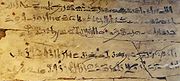 Scribe's exercise tablet with hieratic text on wood, related to Dynasty XVIII, reign of Amenhotep I, c. 1514-1493 BC. Text is an excerpt from The Instructions of Amenemhat II (Dynasty XII), and reads: "Be on your guard against all who are subordinate to you ... Trust no brother, know no friend, make no intimates."
 -
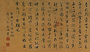 A Chinese traditional title epilogue written by Wen Zhengming in Ni Zan's portrait by Qiu Ying (1470–1559).
 -
![The Papyrus of Ani is a version of the Book of the Dead for the Scribe Ani. This vignette (the small scene that illustrates the text) is about not letting Ani's heart create opposition against him in God's domain.[3]](//upload.wikimedia.org/wikipedia/commons/thumb/7/75/Egypt_dauingevekten.jpg/180px-Egypt_dauingevekten.jpg) The Papyrus of Ani is a version of the Book of the Dead for the Scribe Ani. This vignette (the small scene that illustrates the text) is about not letting Ani's heart create opposition against him in God's domain.[3]
The Papyrus of Ani is a version of the Book of the Dead for the Scribe Ani. This vignette (the small scene that illustrates the text) is about not letting Ani's heart create opposition against him in God's domain.[3]
![The Lantingji Xu, Preface to the Poems Composed at the Orchid Pavilion, is the most famous work of Chinese calligrapher Wang Xizhi, created in the year 353.[a]](/File:LantingXu.jpg)


![The Papyrus of Ani is a version of the Book of the Dead for the Scribe Ani. This vignette (the small scene that illustrates the text) is about not letting Ani's heart create opposition against him in God's domain.[3]](/File:Egypt_dauingevekten.jpg)
Medieval
Medieval religious
-
 A page from Lindisfarne Gospels, c. 710
 -

-
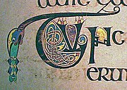 A graphic decoration in the Book of Kells, c. 800
 -
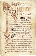 Opening page of Book of Durrow, 7th century


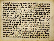
The Qur'an
In Islamic countries, calligraphy was a sacred aspect of the holy book of Islam, the Quran. Muslim scribes used black ink and golden paper to write and draw, using an angled alphabet called the Kufic script. Such writings appeared in the 8th century and reached their apex in the 10th century. Later, decorations of the margins of pages, displaying a variety of graphic techniques, were added in order to beautify the book. In the 12th century, the Naskh alphabet was invented; it featured curves instead of the angled lines of the Kufic script. Other styles, such as Mohaghegh, Rayhani, Thuluth, Reghaa, and Toghii, appeared later on.[4]
-
 A page from a Persian Qur'an in the 11th century.
 -
 Graphic art in an Egyptian Quran of the 9th or 10th century.
 -
 An Iranian Quran of the 15th century found in Uzbekistan.
 -
 A Quran featuring the Kufic alphabet of the 12th century.
.jpg)


Calligraphy
-
![It has been suggested that calligraphy adds a mystical dimension to a text. Such mysticism appears to be consistent with the feeling that a religious text tries to convey. Many religious texts therefore have appeared in calligraphic editions, in order to evoke a spiritual feeling in the reader.[citation needed]](//upload.wikimedia.org/wikipedia/commons/thumb/a/a0/Schedel_register.jpg/126px-Schedel_register.jpg) It has been suggested that calligraphy adds a mystical dimension to a text. Such mysticism appears to be consistent with the feeling that a religious text tries to convey. Many religious texts therefore have appeared in calligraphic editions, in order to evoke a spiritual feeling in the reader.[citation needed]
It has been suggested that calligraphy adds a mystical dimension to a text. Such mysticism appears to be consistent with the feeling that a religious text tries to convey. Many religious texts therefore have appeared in calligraphic editions, in order to evoke a spiritual feeling in the reader.[citation needed] -
![The art of calligraphy in China goes back to 2000 BCE. Chinese calligraphy was used to communicate the philosophical ideas of Confucius and the Hundred Schools of Thought (諸子百家; zhūzǐ bǎijiā")[5]](//upload.wikimedia.org/wikipedia/commons/thumb/9/9a/2a_Zhao_Mengfu_Autumn_Colors_on_the_Qiao_and_Hua_Mountains_%28central_part%29Handscroll%2C_ink_and_colors_on_paper%2C_28.4_x_93.2_cm_National_Palace_Museum%2C_Taipei.jpg/180px-2a_Zhao_Mengfu_Autumn_Colors_on_the_Qiao_and_Hua_Mountains_%28central_part%29Handscroll%2C_ink_and_colors_on_paper%2C_28.4_x_93.2_cm_National_Palace_Museum%2C_Taipei.jpg) The art of calligraphy in China goes back to 2000 BCE. Chinese calligraphy was used to communicate the philosophical ideas of Confucius and the Hundred Schools of Thought (諸子百家; zhūzǐ bǎijiā")[5]
The art of calligraphy in China goes back to 2000 BCE. Chinese calligraphy was used to communicate the philosophical ideas of Confucius and the Hundred Schools of Thought (諸子百家; zhūzǐ bǎijiā")[5] -
 Calligraphy entered Japan from China in the 3rd century BCE, during its states wars. The Japanese used calligraphy to write their haiku on decorative banners.
![It has been suggested that calligraphy adds a mystical dimension to a text. Such mysticism appears to be consistent with the feeling that a religious text tries to convey. Many religious texts therefore have appeared in calligraphic editions, in order to evoke a spiritual feeling in the reader.[citation needed]](/File:Schedel_register.jpg)

Playing cards
It is believed that playing cards were invented in China.
-
![These are card designs from the Mamluk Sultanate of Egypt. c. 1500. According to a passage in Ibn Taghri Birdi's History of Egypt, 1382-1469 A.D., the future sultan al-Malik al-Mu'ayyad won a large sum of money in a game of cards.[13] In the Islamic empire playing cards the suits were coins, cups, swords, and polo sticks.](//upload.wikimedia.org/wikipedia/en/thumb/e/ec/Card_designs_from_the_Mamluk_Sultanate_of_Egypt_c._1500.jpg/180px-Card_designs_from_the_Mamluk_Sultanate_of_Egypt_c._1500.jpg) These are card designs from the Mamluk Sultanate of Egypt. c. 1500. According to a passage in Ibn Taghri Birdi's History of Egypt, 1382-1469 A.D., the future sultan al-Malik al-Mu'ayyad won a large sum of money in a game of cards.[13] In the Islamic empire playing cards the suits were coins, cups, swords, and polo sticks.
These are card designs from the Mamluk Sultanate of Egypt. c. 1500. According to a passage in Ibn Taghri Birdi's History of Egypt, 1382-1469 A.D., the future sultan al-Malik al-Mu'ayyad won a large sum of money in a game of cards.[13] In the Islamic empire playing cards the suits were coins, cups, swords, and polo sticks. -
 Germans introduced woodblock printing
![These are card designs from the Mamluk Sultanate of Egypt. c. 1500. According to a passage in Ibn Taghri Birdi's History of Egypt, 1382-1469 A.D., the future sultan al-Malik al-Mu'ayyad won a large sum of money in a game of cards.[13] In the Islamic empire playing cards the suits were coins, cups, swords, and polo sticks.](/File:Card_designs_from_the_Mamluk_Sultanate_of_Egypt_c._1500.jpg)

Communication
-
![Many medical organizations use the rod of Asclepius as their logo, since it symbolizes the healing arts. This kind of sign is called a pictogram The main advantage of a pictogram is that one does not need to be able to read or to understand a particular language in order to be able to understand the information it conveys.[c]](//upload.wikimedia.org/wikipedia/commons/thumb/4/45/Esculaap.svg/180px-Esculaap.svg.png) Many medical organizations use the rod of Asclepius as their logo, since it symbolizes the healing arts. This kind of sign is called a pictogram The main advantage of a pictogram is that one does not need to be able to read or to understand a particular language in order to be able to understand the information it conveys.[c]
Many medical organizations use the rod of Asclepius as their logo, since it symbolizes the healing arts. This kind of sign is called a pictogram The main advantage of a pictogram is that one does not need to be able to read or to understand a particular language in order to be able to understand the information it conveys.[c] -
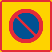 This is the Swedish traffic sign for no parking zone. The red circle with a diagonal line crossing it coveys the idea of "not allowed," and is called an ideogram.
![Many medical organizations use the rod of Asclepius as their logo, since it symbolizes the healing arts. This kind of sign is called a pictogram The main advantage of a pictogram is that one does not need to be able to read or to understand a particular language in order to be able to understand the information it conveys.[c]](/File:Esculaap.svg)

A
Heraldry
-
 This is the imperial coat of arms of Charles V, Holy Roman Emperor. From the time of Otto the Great onward, the various German princes elected one of their peers as King of the Germans, after which he would be crowned emperor by the Pope. The last emperor to be crowned by the pope was Charles V; all emperors after him were technically emperors-elect but were universally referred to as Emperor.
 -
 This is the coat of arm ofAlbert of Sweden. He was the king of Sweden from 1364, and in 1384 he inherited the ducal title of Mecklenburgand united the two countries in a personal union.
 -
 Like Western heraldry, Japanese mons were initially held only by aristocratic families, and were gradually adapted by commoners. Japanese traditional formal attire generally displays the mon of the wearer. Commoners without mon often used that of their patron or the organization they belonged to. This the coat of arms of Gion Mamori of Japan.
 -
![This is the White Rose of York, a white heraldic rose, which is the symbol of the House of York. Traditionally the origins of the emblem are said to go back to Edmund of Langley in the 14th century, the first Duke of York and the founder of the House of York as a Cadet branch of the then-ruling House of Plantagenet.[20] The actual symbolism behind the rose has religious connotations as it represents the Virgin Mary, who was often called the Mystical Rose of Heaven.[20][21]](//upload.wikimedia.org/wikipedia/commons/thumb/0/0a/Yorkshire_rose.svg/180px-Yorkshire_rose.svg.png) This is theEdmund of Langley in the 14th century, the first Duke of York and the founder of the House of York as a Cadet branch of the then-ruling House of Plantagenet.[20] The actual symbolism behind the rose has religious connotations as it represents the Virgin Mary, who was often called the Mystical Rose of Heaven.[20][21]
This is theEdmund of Langley in the 14th century, the first Duke of York and the founder of the House of York as a Cadet branch of the then-ruling House of Plantagenet.[20] The actual symbolism behind the rose has religious connotations as it represents the Virgin Mary, who was often called the Mystical Rose of Heaven.[20][21]

.svg)

![This is the White Rose of York, a white heraldic rose, which is the symbol of the House of York. Traditionally the origins of the emblem are said to go back to Edmund of Langley in the 14th century, the first Duke of York and the founder of the House of York as a Cadet branch of the then-ruling House of Plantagenet.[20] The actual symbolism behind the rose has religious connotations as it represents the Virgin Mary, who was often called the Mystical Rose of Heaven.[20][21]](/File:Yorkshire_rose.svg)
Logos and trademarks
A trademark is a distinctive sign or indicator used by an individual, company, or other entity to identify its products or services and to distinguish them from those of other producers. A trademark is a type of intellectual property, and typically a name, word, phrase, logo, symbol, design, image, or a combination of these elements.[22]
-
![This graphic design of the Coca-Cola logo is the work of Frank Mason Robinson, who created it in 1885.[d] This old Logotype has been around for more than a century, which could be regarded as a measure of its success. A successful logotype will create a sense of loyalty among the clientele.[24]](//upload.wikimedia.org/wikipedia/commons/thumb/c/ce/Coca-Cola_logo.svg/180px-Coca-Cola_logo.svg.png) This graphic design of theLogotype has been around for more than a century, which could be regarded as a measure of its success. A successful logotype will create a sense of loyalty among the clientele.[24]
This graphic design of theLogotype has been around for more than a century, which could be regarded as a measure of its success. A successful logotype will create a sense of loyalty among the clientele.[24] -
![Google is a young high-tech company, and its logotype, created by Ruth Kedar, reminds us of Mondrian minimalism. Kedar has emphasized the playfulness of her design, and its simplicity that conveys an illusion of non-design. According to her, "The colors evoke memories of child play, but deftly stray from the color wheel strictures so as to hint to the inherent element of serendipity creeping into any search results page.... The texture and shading of each letter is done in an unobtrusive way, resulting in lifting it from the page while giving it both weight and lightness."[25]](//upload.wikimedia.org/wikipedia/commons/thumb/3/3e/Google_2011_logo.png/180px-Google_2011_logo.png) Google is a young high-tech company, and its logotype, created byMondrian minimalism. Kedar has emphasized the playfulness of her design, and its simplicity that conveys an illusion of non-design. According to her, "The colors evoke memories of child play, but deftly stray from the color wheel strictures so as to hint to the inherent element of serendipity creeping into any search results page.... The texture and shading of each letter is done in an unobtrusive way, resulting in lifting it from the page while giving it both weight and lightness."[25]
Google is a young high-tech company, and its logotype, created byMondrian minimalism. Kedar has emphasized the playfulness of her design, and its simplicity that conveys an illusion of non-design. According to her, "The colors evoke memories of child play, but deftly stray from the color wheel strictures so as to hint to the inherent element of serendipity creeping into any search results page.... The texture and shading of each letter is done in an unobtrusive way, resulting in lifting it from the page while giving it both weight and lightness."[25]
Rebranding
"Rebranding" means staying relevant as competition heats up and sales start to stagnate. In such circumstances, companies often seek to breathe new life into the brand through rebranding. The idea behind it is that the assumptions made when the brand was established may no longer hold true.[26]
Signage of culture and peace
-
![This flag of the Olympic Games, designed by Pierre de Coubertin, reminds the viewer of the minimalism of Mondrian. According to Coubertin, "This design is symbolic; it represents the five continents of the world, united by Olympism, while the six colours are those that appear on all the national flags of the world at the present time."[27]](//upload.wikimedia.org/wikipedia/commons/thumb/a/a7/Olympic_flag.svg/180px-Olympic_flag.svg.png) This flag of the Olympic Games, designed by Pierre de Coubertin, reminds the viewer of the minimalism of Mondrian. According to Coubertin, "This design is symbolic; it represents the five continents of the world, united by Olympism, while the six colours are those that appear on all the national flags of the world at the present time."[27]
This flag of the Olympic Games, designed by Pierre de Coubertin, reminds the viewer of the minimalism of Mondrian. According to Coubertin, "This design is symbolic; it represents the five continents of the world, united by Olympism, while the six colours are those that appear on all the national flags of the world at the present time."[27]
![This flag of the Olympic Games, designed by Pierre de Coubertin, reminds the viewer of the minimalism of Mondrian. According to Coubertin, "This design is symbolic; it represents the five continents of the world, united by Olympism, while the six colours are those that appear on all the national flags of the world at the present time."[27]](/File:Olympic_flag.svg)
The logo of the Socialist Party (France). The rose symbol represents: community (the flower's petals), socialism (its red color), taking care of those who are less able to compete (the fragility), the struggle (the thorns), cultural life (beauty). Historically, the red rose became the party's emblem during the 1970s. The fist symbol was a sign of resistance. Although the Mitterrand Socialists turned the fist into a graphic holding a rose.[28]
Known worldwide for its
Médecins Sans Frontières, or Doctors Without Borders, is best known for its humanitarian projects in war-torn regions and developing countries facing endemic disease. Its logo using a minimalist approach creates its visual impact.[30]
Information signs: ISOTYPE
In 1921,
Neurath was an enthusiast of sociology. After obtaining his PhD he worked on planning the war economy of the
As Ellen Lupton argues: Neurath suggested:
...two central rules for generating the vocabulary of international pictures: reduction, for determining the style of individual signs; and consistency, for giving a group of signs the appearance of a coherent system". Reduction means finding the simplest expression of an object. For instance, silhouette is a basic technique for reduction. It emulates the shadow of the image without any human intervention. Thus, it is a natural cast rather than a cultural interpretation. The sign as geometric representation of reality is both a rhetorical connotation and a practical technique for many symbol designers. Martin Krampen suggested "simplified realism;" he urged designers to "start from silhouette photographs of objects... and then by subtraction... obtain silhouette pictographs."[33]
Gerd Arntz (1900–1988) was born in a German family of traders and manufacturers. He was a socio-political activist in Düsseldorf, where he joined a movement that aimed to turn Germany into a radical-socialist state form. As a revolutionary artist, Arntz was connected to the Cologne-based "progressive artists group" (Gruppe progressiver Künstler Köln) and depicted the life of workers and the class struggle in abstracted figures on woodcuts. Published in leftist magazines, his work was noticed by Otto Neurath who for his "Vienna method of visual statistics" needed a designer of pictograms that could summarize a subject at a glance. Neurath invited the young artists to come to Vienna in 1928, and work on further developing his ISOTYPE. Arntz designed around 4,000 different pictograms and abstracted illustrations for this system.[34]
Neurath's motto was "words divide, images unite". Many of his designs, together with those of his protégé Gerd Arntz, were the forebears of pictograms we now encounter everywhere, such as the man and woman on toilet doors. As Marina Vishmidt suggests: "Neurath's pictograms owe much to the Modernist belief that reality may be modified by being codified – standardised, easy-to-grasp templates as a revolution in human affairs.[35]
Olympic pictograms
The logos and pictograms for the Olympic Games change every four years and the sponsoring city develops its own logos. Pictograms first appeared at the Olympics in London in 1948. They came into wide use since they simultaneously communicate a message to a large number of people who speak different languages. In the absence of such signs in venues such as the Olympic village there would be a need for many written signs in different languages (for example, for rowing: Roning، Κωπηλασία، Aviron, قایق رانی، and ボート競技, which not only would be costly but also may confuse the viewers).
Symbols for individual sports, developed by Masasa Katzoumie and Yoshiro Yamashita for the Tokyo 1964 Olympics.[36]
Pictograms from the Mexico City
Inspired by the pictograms of Gerd Arntz, Otl Aicher, design director for the 1972 Summer Olympics in Munich, in the words of Michael Bierut, "developed a set of pictograms of such breathtaking elegance and clarity that they would never be topped. Aicher (1922-1991), founder of the Ulm design school and consultant to Braun and Lufthansa, was the quintessential German designer: precise, cool and logical".[36][38]
Olympic Games pictograms of the Barcelona 1992 Olympics were influenced by Aicher's work. However, the geometric shapes were abandoned in favor of the characteristic line of the emblem created by Josep. M. Trias and its stylized simplification of the human body in three parts.[39]
Twenty-four sport pictograms and a series of sport illustrations for the 2010 Winter Olympics were created by Dutch illustrator Irene Jacobs of I'm JAC Design.
Astronomical, statistical, and scientific charts
-
![Astronomical charts have a long history. For instance, an engraving of an ancient Egyptian diagram of the heavens from the Temple of Dendara, depicts the sky on the date of the founding of the temple in 54 BC. The above chart is an astronomical map of the sky drawn by Nicholas Copernicus in 1543 that replaced an earlier chart by Cellarius showing an Earth-centred universe.[40]](//upload.wikimedia.org/wikipedia/en/thumb/6/65/An_astronomical_chart_of_the_sky_drawn_by_Nicholas_Copernicus_in_1543.jpg/180px-An_astronomical_chart_of_the_sky_drawn_by_Nicholas_Copernicus_in_1543.jpg)
-
![In this graphic chart the position of two planets in relation to a viewer, and their position as they appear to a specific viewer is shown. These types of charts are used in various textbooks to describe various scientific phenomena. They are also used by manufacturers in operation manuals to help the buyers become familiar with the workings of a gadget.[41]](//upload.wikimedia.org/wikipedia/commons/thumb/9/9d/Scene-render.svg/129px-Scene-render.svg.png) In this graphic chart the position of two planets in relation to a viewer, and their position as they appear to a specific viewer is shown. These types of charts are used in various textbooks to describe various scientific phenomena. They are also used by manufacturers in operation manuals to help the buyers become familiar with the workings of a gadget.[41]
In this graphic chart the position of two planets in relation to a viewer, and their position as they appear to a specific viewer is shown. These types of charts are used in various textbooks to describe various scientific phenomena. They are also used by manufacturers in operation manuals to help the buyers become familiar with the workings of a gadget.[41] -
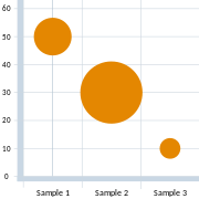 This is a bubble chart, which can show the relationship between three variables. These charts facilitate the understanding of social, economic, medical, and other scientific relationships.
![Astronomical charts have a long history. For instance, an engraving of an ancient Egyptian diagram of the heavens from the Temple of Dendara, depicts the sky on the date of the founding of the temple in 54 BC. The above chart is an astronomical map of the sky drawn by Nicholas Copernicus in 1543 that replaced an earlier chart by Cellarius showing an Earth-centred universe.[40]](/File:An_astronomical_chart_of_the_sky_drawn_by_Nicholas_Copernicus_in_1543.jpg)
![In this graphic chart the position of two planets in relation to a viewer, and their position as they appear to a specific viewer is shown. These types of charts are used in various textbooks to describe various scientific phenomena. They are also used by manufacturers in operation manuals to help the buyers become familiar with the workings of a gadget.[41]](/File:Scene-render.svg)

Statistics are becoming increasingly more important in modern society. Various types of computer software can easily transform large sets of data into charts, graphs, and statistics of various types, to provide us with succinct information to make decisions.[42]
Dynamic designs and computer animation
-
![Computer animation creates the illusion of motion by viewing a succession of computer-generated still images. In the past, animation was produced by filming painted sequences on plastic or paper cels. The above animation was created from photos by Eadweard Muybridge in 1887. Computer animation can be used to produce special effects for educational purposes, such as the study of planetary motions, particle collisions, or fluid dynamics.[43]](//upload.wikimedia.org/wikipedia/commons/thumb/d/dd/Muybridge_race_horse_animated.gif/180px-Muybridge_race_horse_animated.gif) Computer animation creates the illusion of motion by viewing a succession of computer-generated still images. In the past, animation was produced by filming painted sequences on plastic or paper cels. The above animation was created from photos by Eadweard Muybridge in 1887. Computer animation can be used to produce special effects for educational purposes, such as the study of planetary motions, particle collisions, or fluid dynamics.[43]
Computer animation creates the illusion of motion by viewing a succession of computer-generated still images. In the past, animation was produced by filming painted sequences on plastic or paper cels. The above animation was created from photos by Eadweard Muybridge in 1887. Computer animation can be used to produce special effects for educational purposes, such as the study of planetary motions, particle collisions, or fluid dynamics.[43] -
![Dynamic graphics are used to facilitate understanding of concepts in science, engineering, medicine, education, and business. Computer graphics facilitate the production of images that range in complexity from simple line drawings to three-dimensional reconstructions of data. The evolution of a phenomenon through time and its interactions with other elements can be shown through animation.[44]](//upload.wikimedia.org/wikipedia/commons/thumb/2/22/Archimedes-screw_one-screw-threads_with-ball_3D-view_animated_small.gif/180px-Archimedes-screw_one-screw-threads_with-ball_3D-view_animated_small.gif) Dynamic graphics are used to facilitate understanding of concepts in science, engineering, medicine, education, and business. Computer graphics facilitate the production of images that range in complexity from simple line drawings to three-dimensional reconstructions of data. The evolution of a phenomenon through time and its interactions with other elements can be shown through animation.[44]
Dynamic graphics are used to facilitate understanding of concepts in science, engineering, medicine, education, and business. Computer graphics facilitate the production of images that range in complexity from simple line drawings to three-dimensional reconstructions of data. The evolution of a phenomenon through time and its interactions with other elements can be shown through animation.[44] -
![In this 3-D dynamic design a house is studied from various angles. These types of animations can be very useful in the study of various objects. They can also be used to study the evolution of a process through time.[45]](//upload.wikimedia.org/wikipedia/commons/thumb/d/d3/Camera_focal_length_distance_house_animation.gif/180px-Camera_focal_length_distance_house_animation.gif) In this 3-D dynamic design a house is studied from various angles. These types of animations can be very useful in the study of various objects. They can also be used to study the evolution of a process through time.[45]
In this 3-D dynamic design a house is studied from various angles. These types of animations can be very useful in the study of various objects. They can also be used to study the evolution of a process through time.[45] -
 The art of dynamic design is still in its infancy. With the availability of sophisticated computer graphics techniques, the horizon has been expanded enormously for graphic designers.
![Computer animation creates the illusion of motion by viewing a succession of computer-generated still images. In the past, animation was produced by filming painted sequences on plastic or paper cels. The above animation was created from photos by Eadweard Muybridge in 1887. Computer animation can be used to produce special effects for educational purposes, such as the study of planetary motions, particle collisions, or fluid dynamics.[43]](/File:Muybridge_race_horse_animated.gif)
![Dynamic graphics are used to facilitate understanding of concepts in science, engineering, medicine, education, and business. Computer graphics facilitate the production of images that range in complexity from simple line drawings to three-dimensional reconstructions of data. The evolution of a phenomenon through time and its interactions with other elements can be shown through animation.[44]](/File:Archimedes-screw_one-screw-threads_with-ball_3D-view_animated_small.gif)
![In this 3-D dynamic design a house is studied from various angles. These types of animations can be very useful in the study of various objects. They can also be used to study the evolution of a process through time.[45]](/File:Camera_focal_length_distance_house_animation.gif)

Pioneers of modern graphics and industrial design
-
![In 1907, AEG (Allgemeine Elektricitäts-Gesellschaft) retained Peter Behrens (1868–1940), a German architect and designer, as artistic consultant. He designed the entire corporate identity (logotype, product design, publicity, etc.), and for that, he is considered the first industrial designer in history. He never became an employee of AEG but worked as an artistic consultant.[46]](//upload.wikimedia.org/wikipedia/commons/thumb/6/6d/Allgemeine_Elektricit%C3%A4ts-Gesellschaft_%28logo%29.svg/180px-Allgemeine_Elektricit%C3%A4ts-Gesellschaft_%28logo%29.svg.png) In 1907, AEG (Allgemeine Elektricitäts-Gesellschaft) retained Peter Behrens (1868–1940), a German architect and designer, as artistic consultant. He designed the entire corporate identity (logotype, product design, publicity, etc.), and for that, he is considered the first industrial designer in history. He never became an employee of AEG but worked as an artistic consultant.[46]
In 1907, AEG (Allgemeine Elektricitäts-Gesellschaft) retained Peter Behrens (1868–1940), a German architect and designer, as artistic consultant. He designed the entire corporate identity (logotype, product design, publicity, etc.), and for that, he is considered the first industrial designer in history. He never became an employee of AEG but worked as an artistic consultant.[46] -
![Paul Rand (1914–1996), an American graphic designer, is best known for his corporate logo designs. His career began with a part-time position creating stock images for a syndicate that supplied graphics to various newspapers and magazines.[47] Between his class assignments and his work, Rand was able to amass a fairly large portfolio, largely influenced by the German advertising style Sachplakat (object poster) as well as the works of Gustav Jensen.[48]](//upload.wikimedia.org/wikipedia/commons/thumb/5/51/IBM_logo.svg/180px-IBM_logo.svg.png) Sachplakat (object poster) as well as the works of Gustav Jensen.[48]
Sachplakat (object poster) as well as the works of Gustav Jensen.[48]
![In 1907, AEG (Allgemeine Elektricitäts-Gesellschaft) retained Peter Behrens (1868–1940), a German architect and designer, as artistic consultant. He designed the entire corporate identity (logotype, product design, publicity, etc.), and for that, he is considered the first industrial designer in history. He never became an employee of AEG but worked as an artistic consultant.[46]](/File:Allgemeine_Elektricit%C3%A4ts-Gesellschaft_(logo).svg)
Raymond Loewy (1893–1986) was one of the best-known industrial designers of the 20th century. Born in France, he spent most of his professional career in the United States. Among his many contributions were the Shell logo, the Greyhound bus, the S-1 locomotive, the Lucky Strike package, Coldspot refrigerators, and the Studebaker Avanti. Loewy was first approached by the Greyhound Corporation to redesign its logo. The company's logo looked like a "fat mongrel," he said. So, he created a slimmed-down version that is still used today.[49]
William Golden (1911–1959) is one of the pioneers of American graphic design. He was born in lower Manhattan, the youngest of twelve children. His only formal schooling was at the Vocational School for Boys, where he learned photoengraving and the basics of commercial design. In conjunction with the Didot typeface, Golden developed the famous CBS eye logo. It has been suggested that the eye was inspired by an article in Alexey Brodovitch's Portfolio about the subject of Shaker design.[50]
Placards and posters
Placard and posters existed from the ancient times. Persian reliefs depicted important historical events; the Greek axons and the Roman albums, with their decorative designs and announcements, were quite similar to today's posters. In ancient Greece the name of athletes, and games schedules were written on columns that slowly turned on an axis. Romans markets had whitewashed walls on which sellers, money lenders, and slave traders wrote announcements and advertised their products; to attract the attention of customers they added attractive designs to their announcements.[51]
Ancient reliefs
Emergence of the print and design industry
Around 1450,
-
 Aristotle printed by Aldus Manutius, 1495-98 (Libreria Antiquaria Pregliasco, Turin)
 -

-
 The printer's device of William Caxton, 1478.
 -
 A woodcut from William Caxton's second edition ofChaucer's The Canterbury Tales, printed in 1483.


Engraving
Engraving is the practice of incising a design onto a hard, usually flat, surface, by cutting grooves into it. The process was developed in Germany in the 1430s from the engraving used by goldsmiths to decorate metalwork. Engravers use a hardened steel tool called a burin to cut the design into the surface, most traditionally a copper plate.[54] Gravers come in a variety of shapes and sizes that yield different line types.
-
 Theodor de Bry (1528 – 1598) was an engraver, goldsmith and editor. A self-portrait engraving by Theodorus de Bry, confirming his origins from Liège (in Latin, "Leodiensis"), a city at that time belonging neither to Flanders or Wallonia, or even to Belgium.
 -
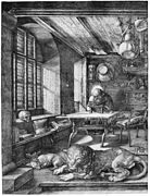 Albrecht Dürer, St. Jerome in His Study (1514). Dürer was a German painter and printmaker.
 -
 Ecce Homo, engraving, 15th century, by Martin Schongauer(c. 1448 – 1491). He was a German engraver and painter, and was the most important German printmaker before Dürer.
 -
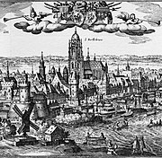 Matthäus Merian, View of Frankfurt, between 1612 and 1619. Merian was a notable Swiss engraver.


Etching
Etching is the process of using strong acid or mordant to cut into the unprotected parts of a metal surface to create a design in intaglio in the metal. This technique is believed to have been invented by Daniel Hopfer (c. 1470–1536) of Augsburg, Germany, who decorated armour in this way, and applied the method to printmaking. Etching soon came to challenge engraving as the most popular printmaking medium. Its great advantage was that, unlike engraving which requires special skill in metalworking, etching is relatively easy to learn for an artist trained in drawing.
-
 Court jester of Emperor Maximilian I. Etching by Daniel Hopfer, (1493).
 -
 Gardener with Basket, c. 1612, Etching byLorraine, now in France.(c. 1575 - 1616).
 -
 Pornocrates (in etching and aquatint, 1896) by Félicien Rops, a Belgian artist and printmaker.
 -
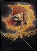 William Blake's Ancient of Days, etching/watercolour, (1794).


.jpg)
_British_Museum.jpg)
Modern graphic design
In the second half of the 19th century, William Morris's Kelmscott Press produced many historicist graphic designs and created a collectors market for this kind of art. In Oxford he associated with artists like Edward Burne-Jones and Dante Gabriel Rossetti. Together they formed the Pre-Raphaelite Brotherhood, and their ideas influenced modern graphic design considerably.[55]
-
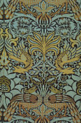 This fabric design, called Peacock and Dragon, is the work of William Morris (1878) and is an example of decorative graphic design. Such designs were revived during the 1960s with the emergence of thehippie movement.
 -
 This Morris Tulip and Willow design (1873) is another example of decorative graphics. By using a diagonal blue, with only some suggestion of orange, the artist tries to create a harmonious color scheme that could be used effectively in the design of a poster or other graphic design media.
 -
 This is the first page of The Nature of Gothic by John Ruskin, which was published by Morris' Kelmscott Press. The decorative design was the revival of the Gothic style in graphic design.
 -
 This book of poetry, called Rubaiyat, by the famous Persian poet Omar Khayyam, is an example of early modern graphic design cooperation. The graphic composition of calligraphy and its decorative design are by Morris and the painting is by Burne-Jones.


.jpg)

In 1917,
Posters Post-World War II
After the
Psychedelic design
The word "
Although San Francisco remained the hub of psychedelic art into the early 1970s, the style also developed internationally. The English rock band Pink Floyd worked extensively with London-based designers Hipgnosis to create graphics to support the concepts in their albums like the cover of the soundtrack of the film More'. Life magazine's cover and lead article for the September 1, 1967, issue at the height of the Summer of Love focused on the explosion of psychedelic art on posters and the artists as leaders in the hippie counterculture community.
The 1968 animated film Yellow Submarine was a milestone in graphic design. Inspired by new trends in art, it sits alongside the dazzling Pop art styles of Andy Warhol, Martin Sharp, Alan Aldridge, and Peter Blake. Heinz Edelmann was hired by TVC as the art director for Yellow Submarine. Before making the film, TVC had produced The Beatles, a 39-episode TV series "produced" by Al Brodax and King Features. Despite the critical acclaim for his design work for the film, Edelman never worked on another animated feature.[58]
Poster design in Japan
The distinctive aesthetics of Japanese graphic design have been admired over many decades, winning awards at prestigious international venues.[59]
The works of Japanese graphic designers are noted for their resourcefulness, powerful visual expression, and extraordinary technical quality of print.[60]
The distinctive artistic language and typographic sophistication show particularly in Japanese poster-design. The Japanese poster is a compelling pictorial medium and an original work of art, reflecting in full the designer's creative talent.[citation needed]
Chinese cultural revolution
The poster "Revolution promotes production", created by He Shuxui, celebrates traditional
A worker named Wang Qingcang created the poster, "The three countries of Indo Zhina (Lao, Cambodia, Vietnam) will win!". On the upper left side, it says "Enemies are getting sicker and sicker every day, and we are getting better and better every day." (The U.S. supported Indo Zhina (
The poster "Mao Zedong at Jinggang Mountain" depicts a young Mao Zedong sitting against the background of the Jinggang Mountains. The mountain symbolizes Mao's leadership and his vision to unite the oppressed masses to fight against the ruling class. Created by Liu Chunhua and Wang Hui, October 1969.[63]
The poster, "Time is Money", features the famous Canadian doctor Norman Bethune (Dr. Bai Qiuen in Chinese), racing to rescue another patient. Bethune became an early proponent of universal health care, the success of which he observed during a visit to the Soviet Union. As a doctor in Montreal, Bethune frequently sought out the poor and gave them free medical care. As a thoracic surgeon, he traveled to Spain (1936–1937) and to China (1938–1939) to perform battlefield surgical operations on war casualties. Created by Zhang Xin Gua. Hebei People's Publishing House.[64]
Culture and politics
The "Barack Obama "Hope" poster" poster is an iconic image of Barack Obama designed by artist Shepard Fairey. The image became one of the most widely recognized symbols of Obama's campaign message, spawning many variations and imitations, including some commissioned by the Obama campaign. In January 2009, after Obama had won the election, Fairey's mixed-media stenciled portrait version of the image was acquired by the Smithsonian Institution for its National Portrait Gallery. (In October 2009, Fairey admitted that he had based the poster on an Associated Press photograph and had fabricated and destroyed evidence to hide the fact.)[65]
-
 This political poster by Tiocfaidh Ár Lá about Ulster.
 -
 Andrew Pavlovsky poster of Poet MAYAKOVSKIY (2003). This poster is a graphic illustration of a true interest in Constructivism in Russia today. Constructivism was almost always in demand in Russia and it has since become one of Russia's principal trends. Some contemporary Russian artists and art historians have already suggested the new term "Additive Constructivism." It emphasizes the return to modernism, which starts to significantly push out the postmodern art practices. It's not a postmodern performance. The Constructivist color solution proves that so it is.


Computer-aided graphic design in posters
With the arrival of computer-aided graphic design an assortment of novel effects, digital techniques, and innovative styles have emerged in poster designs. With software such as Adobe Photoshop, Corel Painter, and Microsoft Paint, image editing has become very cheap and artists can easily experiment with a variety of color schemes, filters, and special effects. For instance, utilizing various filters of Photoshop, many artists have created "vectored" designs in posters where a photographic image is solarized, sharpened, rendered into watercolor or stained glass effects, or converted into bare lines with block colors. Other designs created soft or blurry styles, ripple or cascade effects, and other special filters.
Advertising
Graphic design is used in advertising to announce a persuasive message by an identified sponsor, or the promotion by a firm of its products to existing and potential customers. Egyptians used papyrus to make sales messages and wall posters. Commercial messages and political campaign displays have been found in the ruins of Pompeii and Ancient Arabia. Lost-and-found advertising on papyrus was common in Ancient Greece and Ancient Rome. Wall or rock painting for commercial advertising is another manifestation of an ancient advertising form, which is present to this day in many parts of Asia, Africa, and South America.[66]
Advertising in the 19th century
-
 This advertising flier from 1806 is for a traditional medicine called Kinseitan. Displayed in the Edo-Tokyo Museum.
 -
 This is a 19th-century advertising poster for the hydrotherapic baths of Bagnoles-de-l'Orne (France).
 -
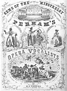 This is a playbill for Perham's Opera Vocalists, 1856.
 -
 This poster from the second half of the 1880s advertisesBuffalo Bill's Wild West show, advertising "Miss Annie Oakley, the peerless lady wing-shot".


Advertising in the early 20th century
-
 This is a German poster by Fritz Rehm for Laferme Cigarettes (published 1896–1900)
 -
 Circus poster, 1899. "Forepaugh & Sells Brothers Shows Combined. The world-famed Hanlon Troupe in the most astonishing mid-air achievements ever accomplished."
 -
 "Drink Coca-Cola 5¢", an 1890s advertising poster showing a woman in fancy clothes (partially vaguely influenced by 16th- and 17th-century styles) drinking Coke.


German Plakatstil, "Poster style"
In the early 20th century, Germany became the cradle of many of the avant-garde art movements, particularly posters. This created the "Plakatstil" or "Poster style" movement. This movement became very influential and had a considerable impact on the graphic design of posters. Posters in this style featured few but strong colours, a sharp, non-cluttered, minimal composition and bold, clear types.[67]
Ludwig Hohlwein

Ludwig Hohlwein was born in Germany in 1874. He was trained and practiced as an architect until 1906 when he switched to poster design. Hohlwein's adaptations of photographic images was based on a deep and intuitive understanding of graphical principles. His creative use of color and architectural compositions dispels any suggestion that he used photos as a substitute for creative design.
Riquet Pralinen Tea c. 1920–1926. Hohlwein was born in the
Poster historian Alain Weill comments that,
Hohlwein was the most prolific and brilliant German posterist of the 20th century.... Beginning with his first efforts, Hohlwein found his style with disconcerting facility. It would vary little for the next forty years. The drawing was perfect from the start, nothing seemed alien to him, and in any case, nothing posed a problem for him. His figures are full of touches of color and a play of light and shade that brings them out of their background and gives them substance.[68]
Lucian Bernhard
Over the course of his career, which lasted well into the 1950s, Lucian Bernhard (1883–1972) became a prolific designer not only of innovative posters but of trademarks, packaging, type, textiles, furniture, and interior design.
Advertising in the 1920s-30s era
-
 Pierce-Arrow auto ad, from advertisement in Life magazine, 1919
 -
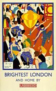 The London Underground Electric Railway Company Ltd. published this poster in 1924.


1972 Olympics and Otl Aicher posters
The internationally recognized artist
In Munich's original bid for the 1972 Olympics, one of the main promises was to create a synthesis between sport and art. Otl Aicher was appointed as the head of the committee's visual design group, and his mandate was to deploy art in a relatively new role of promoting this global public event. From the start, posters were high on the agenda of the organizing committee, and ideas were discussed as early as September 1967 to publish a series of art posters that would "relate artistic activity to the Olympic Games and engage the best artists to collaborate," and also to commission an internationally known artist for the official poster.[70]
Otl Aicher created the official posters for the 1972 Olympic Games in Munich. As he pointed out in his essay "Entwurf der Moderne"[71] ("Designing the Modern Era"), the German word entwerfen, meaning "to draft" or "design", also contains the verb werfen, meaning "to throw". But where? To whom? What? And with what intention? As Benjamin Secher writes:
He devised an invigorating, almost
Day-glo palette for the Olympics that was utterly free of red and black — banned for their association with the German flag. Athletes depicted in the official posters for each sport had their uniforms stripped of any national identifier, leaving the emphasis firmly on individual effort. Even the logo for the Games, a graphic of a radiant sun, hammered home the message of universality and, above all, optimism.[72]
Aicher developed a comprehensive system to articulate the games' character across a wide range of materials, from signage to printed pieces and even staff uniforms. As the introduction to his exhibition at states: "His works, including official posters and sporting event tickets, demonstrate the design tools Aicher used to join individual elements to the collective: structural grids, a bold and animating color palette, and ingenious pictograms. Aicher's orderly and pleasant design nimbly carried the weight of modern German history as it repositioned the nation's hospitality on the world stage".[73]
This is a poster of 1972 Olympics Yachting in Germany designed by Otl Aicher. Using a bright color scheme, borrowed from 60s pop art and psychedelic art, and combining it with German modernism, Aicher creates this visual graphic program.
Current advertising
Nike's My Butt is Big poster appears to convey a bold and honest statement. The only part of a human body in the picture is a buttocks. The text of a poem on the right repeats the curved form of the woman's bottom which is repeated again with a vividly colored splosh of red and purple dots in the background. The background is white, which contrasts with the darker skin of the model. The statement, "My butt is big" is red and larger than the rest of the poem. Image:Courvoisier Cognac.jpg | This is a modern advertisement poster for Courvoisier cognac. A balanced composition of the hands, feet, and face of the figure on a black background appears to convey the message of this poster.
This is a lookalike poster advertisement for Wendy's "Where's the beef?" campaign. In the TV version of this ad, Clara Peller, a gray-haired actress, stared at an unimpressive-looking hamburger and asked, "Where's the beef?" This simple message was so sharp that by asking the same question about his rival's platform, Vice President Walter Mondale effectively neutralized Colorado Senator Gary Hart's momentum in the 1984 presidential campaign.
This is a perfume advertisement for
Comics and graphic novels
A
Superman is widely considered to be an American cultural icon.[76][77] Created by American writer Jerry Siegel and Canadian-born artist Joe Shuster in 1932, the character first appeared in Action Comics in 1938. The character's appearance is distinctive and iconic: a red, blue, and yellow costume, complete with a cape and a stylized "S" shield on his chest.[78][79]
Selecting the old-fashioned comic book as subject matter, Roy Lichtenstein used the splash page of a romance story drawn by Tony Abruzzo and lettered by Ira Schnapp in Secret Hearts #83 (Nov. 1962), and slightly reworked the art and dialogue by re-lettering Schnapp's original word balloon. This precise composition, titled Drowning Girl, (1963), is now part of the permanent collection of the Museum of Modern Art, New York.[80]
Web Design
Graphic design is used to make a
Modern life
Today graphic design has penetrated into all aspects of modern life. In particular modern architecture has been influenced by graphics.[84]
-
 Robert Smithson's monumental graphic art earthwork Spiral Jetty (1970) is located on the Great Salt Lake in Utah. Using black basalt rocks and earth from the site, the artist created an artistic composition in the translucent red water with a graphic design 1,500 feet long and 15 feet wide.
 -


Notes
- ^ "This calligraphy describes a gathering of 42 poets including Xie An and Sun Chuo at the Orchid Pavilion near Shaoxing, Zhejiang, during the Spring Purification Festival to compose poems and enjoy the wine. The poets had agreed to participate in a drinking contest: wine cups were floated down a small winding creek as the men sat along its banks; whenever a cup stopped, the man closest to the cup was required to drink it and write a poem. In the end, twenty-six of the participants composed thirty-seven poems."[2]
- ^ The Kuei t'ien lu, a book of anecdotes written in the 11th century by the historian Ouyang Xiu, has been cited as placing the invention of playing cards in the middle of the Tang dynasty (618-906). However, these early references appear to refer to domino cards.[6]
- ^ According to Greek mythology, Asclepius was said to have learned the art of healing from the centaur Chiron. He is customarily represented as a surgeon on the ship Argo. Asclepius was so skilled in the medical arts that he was reputed to have brought patients back from the dead. For this, he was punished and placed in the heavens as the constellation Ophiuchus (meaning "serpent-bearer").
- ^ There is no proof as to who originally hand-wrote it, but Master Penman Louis Madarasz (1859-1910) was said to have told one of his students that the work was his. When the work was created, Madarasz had a mail-order business and could easily have done it, and the writing style is similar to his. In the book An Elegant Hand, by William E. Henning, it states that Robinson, who was the bookkeeper of the firm, originated the name "Coca-Cola" and specified that it be written in Spencerian script.[23] In a 1914 court case, Robinson testified that he was "practically the originator" and that "some engraver here by the name of Frank Ridge was brought into it."[citation needed]
- Alexandre Steinlen, Alphonse Mucha, and Henri de Toulouse-Lautrec made compelling posters advertising products entertainments and restaurants. Matt Morgan's circus advertisements (c. 1890) started the American poster, and this was followed by Edward Penfield, Will H. Bradley, Maxfield Parrish, Howard Chandler Christie, James Montgomery Flagg, Charles Dana Gibson, and Harrison Fisher.[53]
References
Citations
- ISBN 978-0-300-17260-7.
- ^ Kraus, Richard Kurt (1991). Brushes with Power. Berkeley: University of California Press. p. 27.
- ISBN 9780714109794.
- Drogin, Marc (1980). Medieval Calligraphy: Its History and Technique. New York: Dover Publications.
- Miner, Dorothy E. (compiler) (1972). 2000 Years of Calligraphy:, an Exhibition Organized [1965] by the Baltimore Museum of Art, et al. New Jersey: Rowman & Littlefield.
Exhibition, 'The World of Playing Cards', at the Guildhall Library, London ( Sept. 1995–Mar. 1996).
- "World Wildlife Fund". Charity Navigator.
- McKinney, Michael L.; Schoch, Robert M. "Environmental Organizations". Environmental Science: Systems and Solutions (Third ed.). Jones and Bartlett Publishers. Archived from the original on 2006-10-21.
- Parnes, Robin Brett (3 December 2007). "How the World Wildlife Fund Works". How Stuff Works.
- "A History of WWF: The Sixties". WWF-The Conservation Organization.
- Heller, Steven (May–June 1997). "Thoughts on Rand". Print. pp. 106–109.
- Bierut, Michael (Jan–Feb 1997). "Tribute: Paul Rand 1914–1996". I.D. p. 34.
- Rand, Paul (1947). Thoughts on Design. New York: Wittenborn.
- Kroeger, Michael (15 February 2006) [8 February 1995]. "Interview with Paul Rand". MK Graphic Design.
Concept by Hubert Riedel, texts by Hubert Riedel, Rene Grohnert, Karl Bernhard.
{{cite book}}: CS1 maint: location (link)